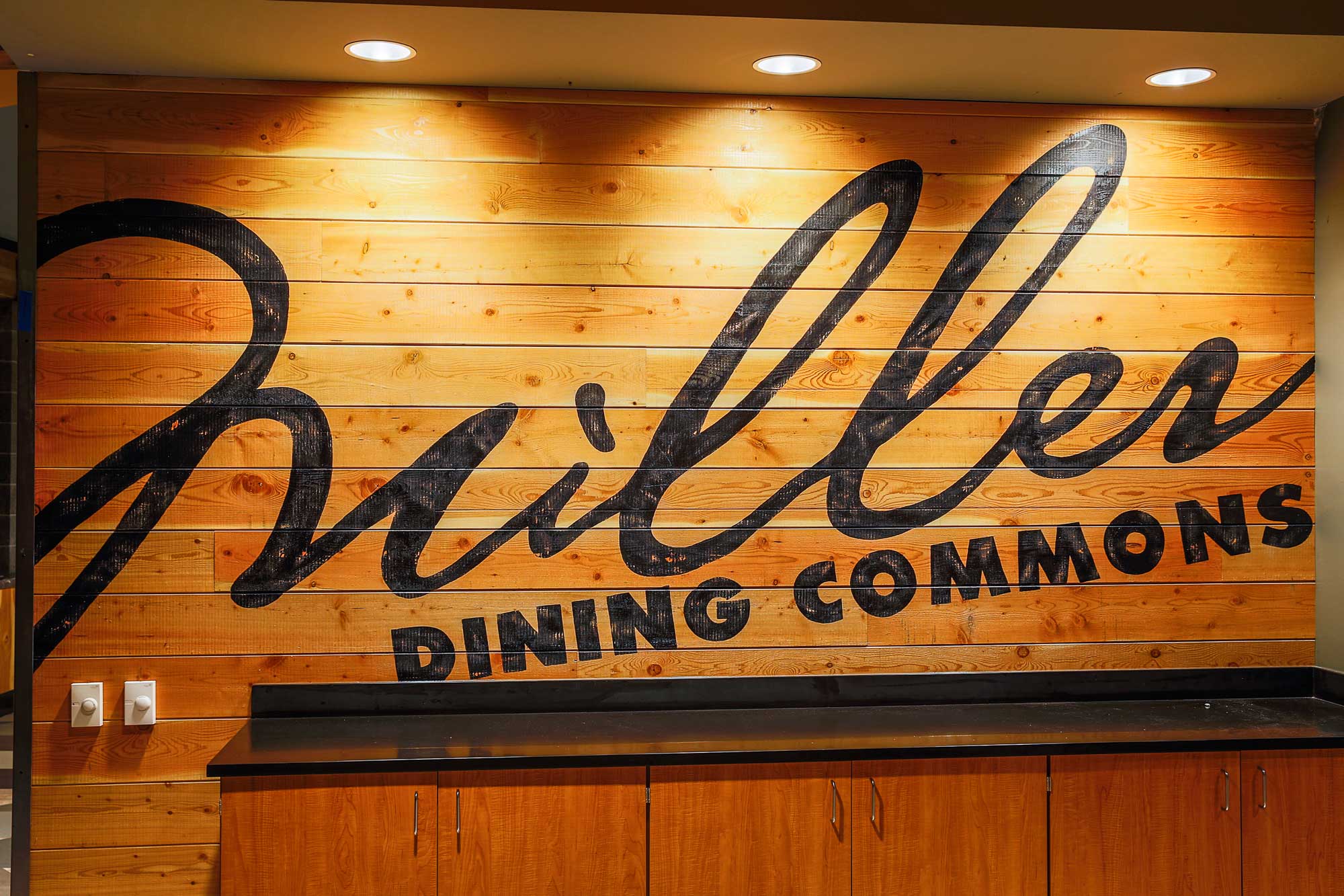
MILLER DINING COMMONS, Montana State University
This remodeled Montana State University (MSU) dining hall previously nicknamed "The Shwag" by staff and students for it's monochromatic interior and bland dining stations, received a much needed facelift in 2016. Our team was brought in to take the branding and individual culinary stations to an elevated level that represented the diverse student and staff population of diners. Working with the folks at MSU we took the previously established names along with the architectural drawings and ran with the project. Over a 4 month period of time we were able to develop the branding, source and produce the signage and complete installation on budget and before the beginning of the fall semester. You could say we took the "The Shwag" to Swag with our contribution to this award-winning student-dining atmosphere which now serves over 7,000 students and staff daily.

12 dining concepts and one ton of team effort
The branding and signage within this venue was designed by yours truly in partnership with one other graphic designer and the over sight of Prime's creative director. We rocked out this original branding in a 4 week timeline to allow for sign production and meet our strict beginning-of-school-year timeline. Sorry sleep, duty calls...


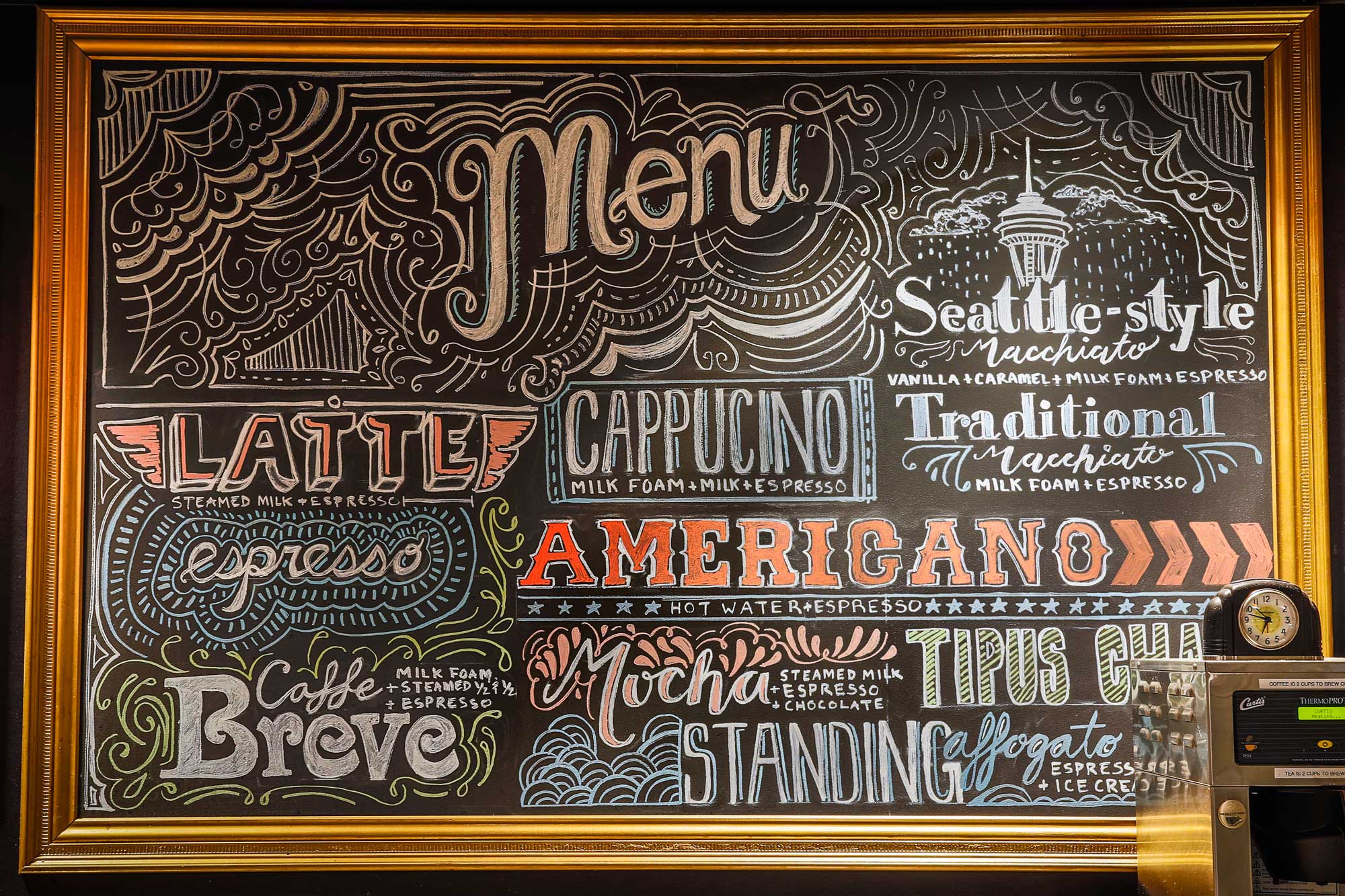
The Froth and Foam brand was created with contemporary coffee shops in mind. We wanted to create a space that differentiated itself from the other culinary stations within the dining commons. This identity needed to stand out to students and staff not only as a place to stop for their morning coffee, but THE SPOT for their morning coffee.


Ooo LED
The cool blue glow of the Blaze's flame and lettering help this sign pop out in one of the darker spots within the dining space.
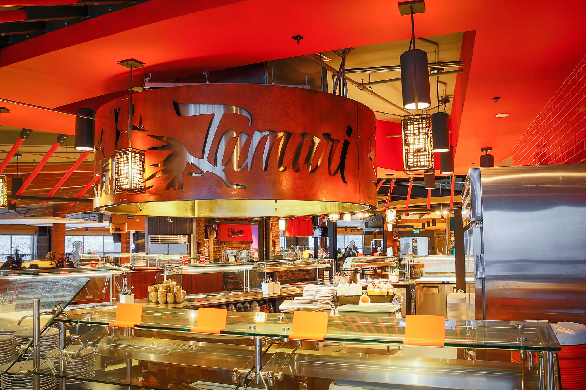
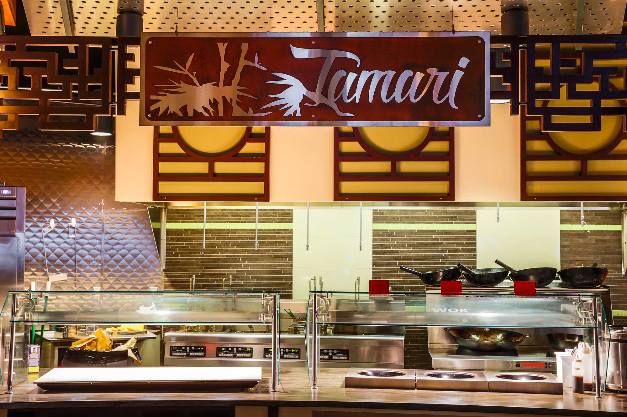
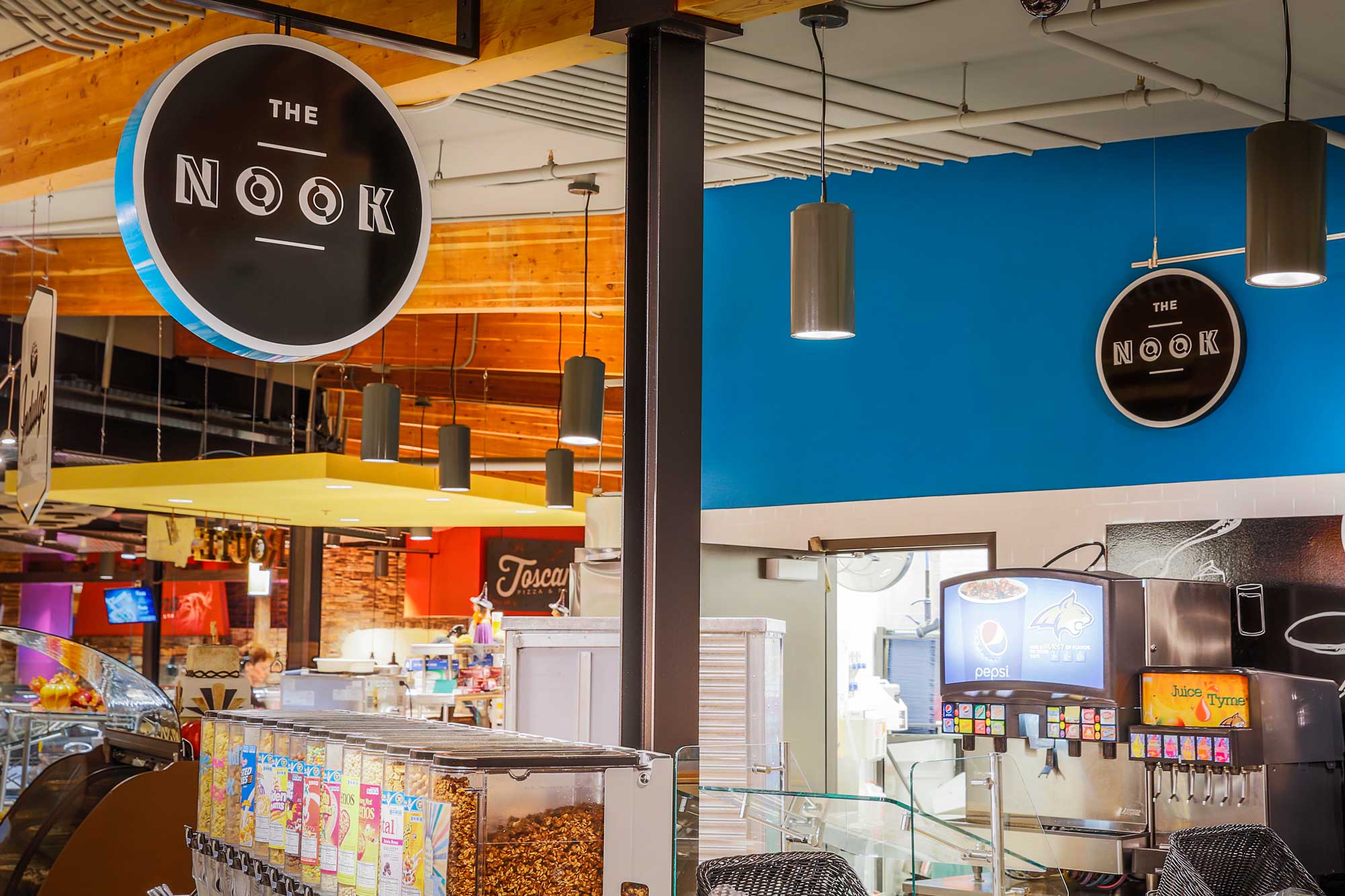
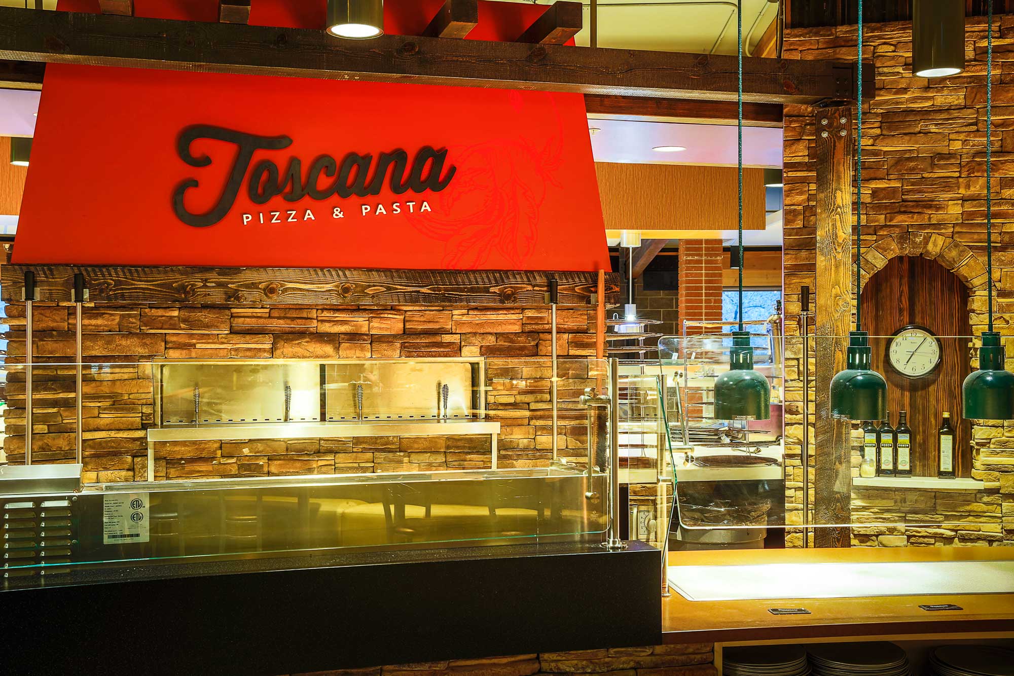
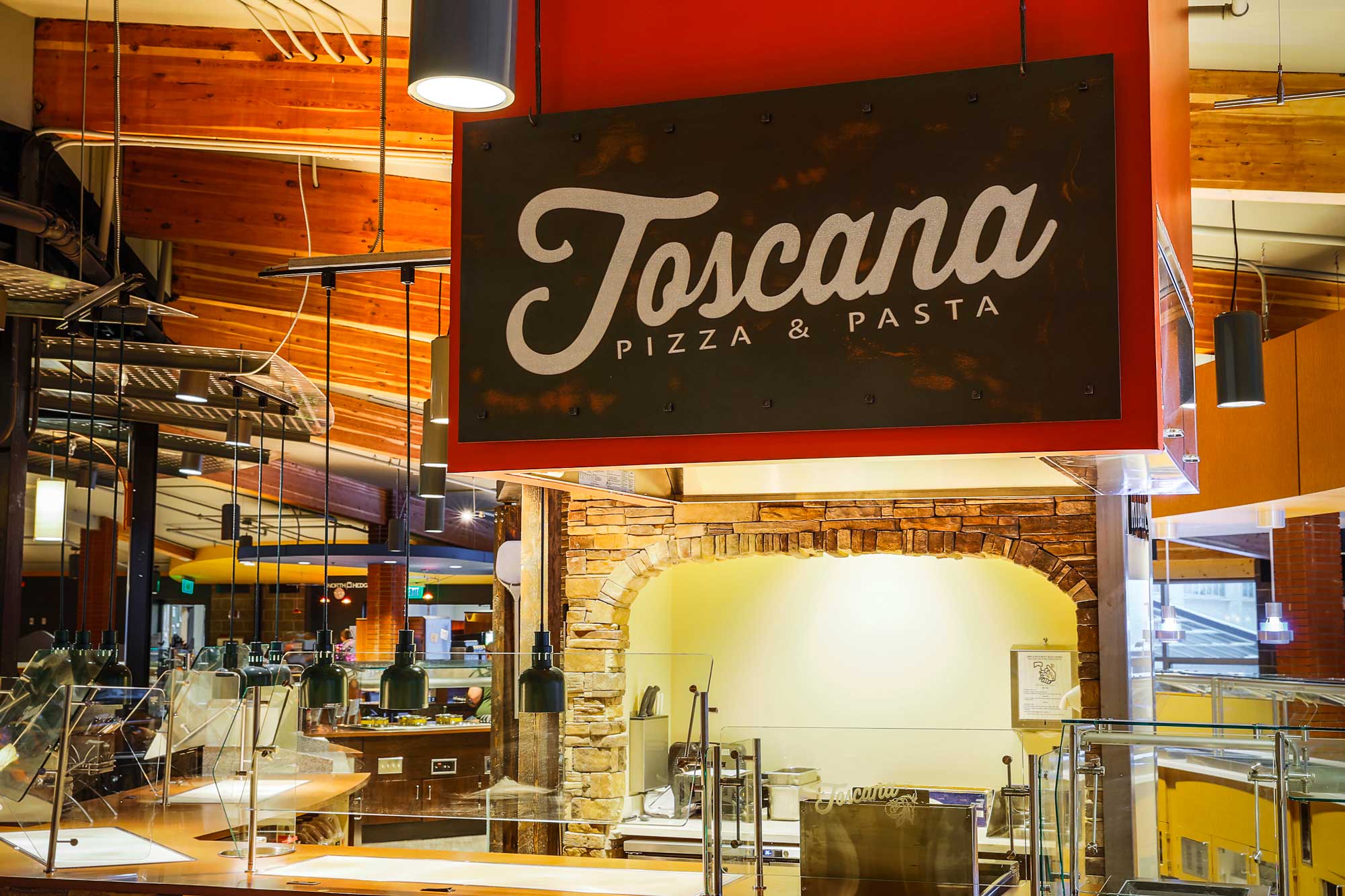
A sign here, a sign there
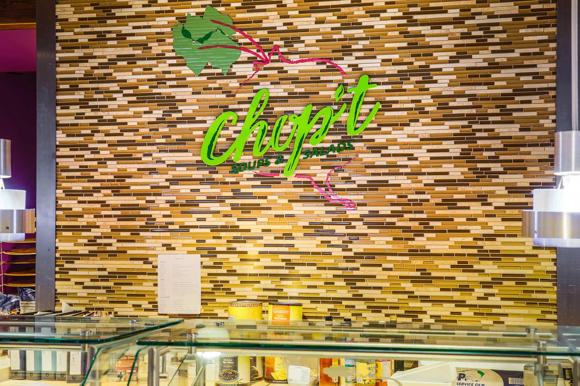
Throughout this venue it was a challenge to brand a variety of culinary areas that needed to exist cohesively in one space. We were able to bring the branding together for larger serving areas with multiple prep stations by creating accompanying signs that weren't just reproductions of the original. The brands range from more modern to traditional styles, but with creative use of materials and attention to detail, the brands live happily-ever-after in this new dining space.


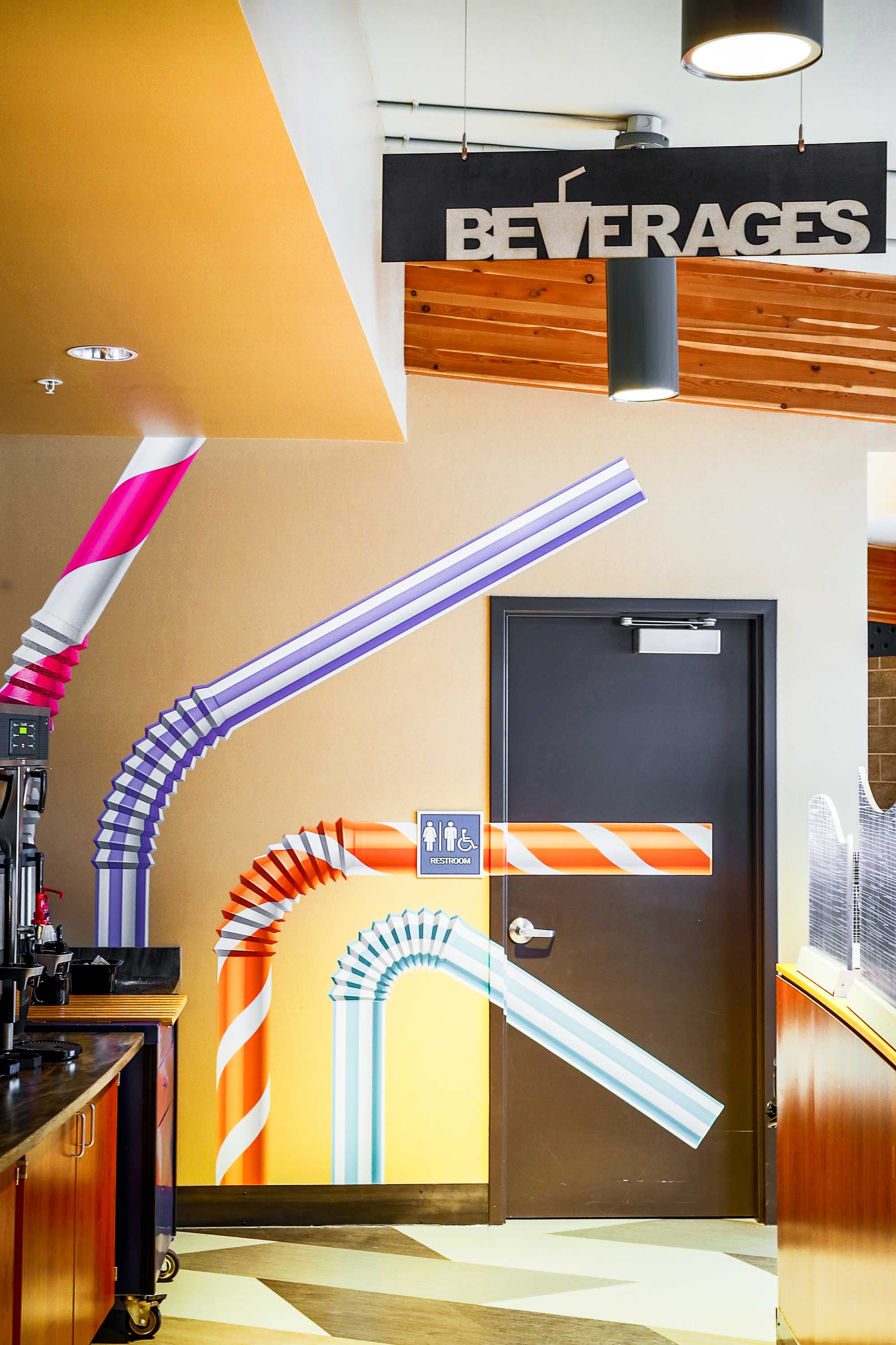
We could not let the wayfinding signage go to the wayside. These custom signs are throughout the venue to guide students to beverage stations, dorm rooms, and the dish room.